ARCHITECTURAL DESIGN PRESENTATION 16th Dec.
I n g r e s M u s e u m E x t e n s i o n
The final project of the Ingres Museum extension is
the result of a series of transformations and changes from the first proposal
that I presented. However, I try to maintain the main ideas of the project, as
they are, the visual and physical connection between the Ingres museum and the
new extension, a dynamic and free path, a staggering of voids in the different
levels, and later, an iconic and monumental element, which is the tower.
The building try to fill the empty of the plot, at the
same time that appears like an extension of the facade of the Ingres museum.
The horizontal volume try to integrate with the environment, like a introverted
and reserved box. The entrance is not show immediately, because visitor have to
descend through a ramp until a lower level, in where emerge a little and dark courtyard
between two huge walls generating an oppression sensation.
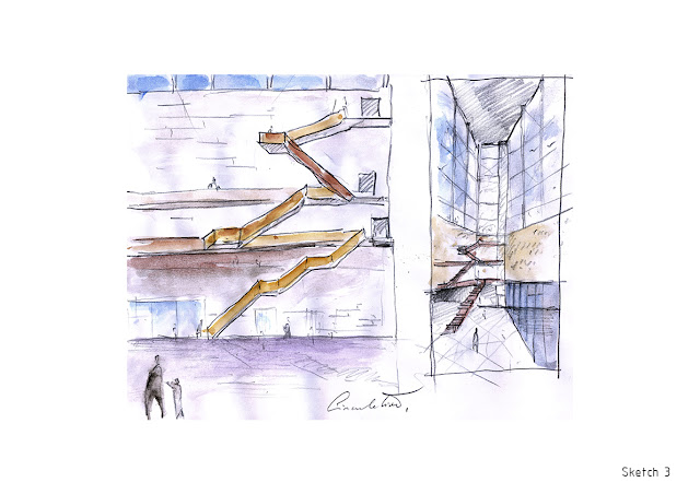
Then, upon entering the museum appear a great hall
below of the steel and glass tower. The different equipment’s, like the
conference room, the toilets, the bookshop and etc., are located radially to
this space, at the edges, for achieve to meeting square.
The circulation is organized within of the glass tower
through some suspended stairs. The exposition rooms are divided in tree zones because
of the appearance of the empties that cross all the plans or levels. The first
space is the exposition area, the second is the transition space, and the third
is the exterior area that the visitor can observe an interesting views and
perspectives of the building, and also of the river, through a horizontal
windows that rip the facade.
In the end of the museum path the visitor arrives to
great picture window that it can observe the Ingres museum, in where is
performed a little intervention, that consist in the introduction of the
suspended metallic box, that contains a sculpture of a Ingres painting girl in
gold stabilizing a psychological and visual connection between the visitor a
both buildings.
Finally, if the visitor want to enjoy of the privileged
and wonderful views of the riverside, it can to ascend to the highest level of
the tower. This area, is a polyvalent space that it can be a bar, exposition
room or meeting place.
The building is constructed mainly in concrete the
horizontal part, and in metallic structure the tower that become less invasive
and shocking than a concrete tower. The wall surface of the facade is built in
pigmented scratched concrete, to provide a sensation of greater weight and
roughness. The lower floor facade is built in U-Glass, that try to give the
sensation that the heavy horizontal volume float.


